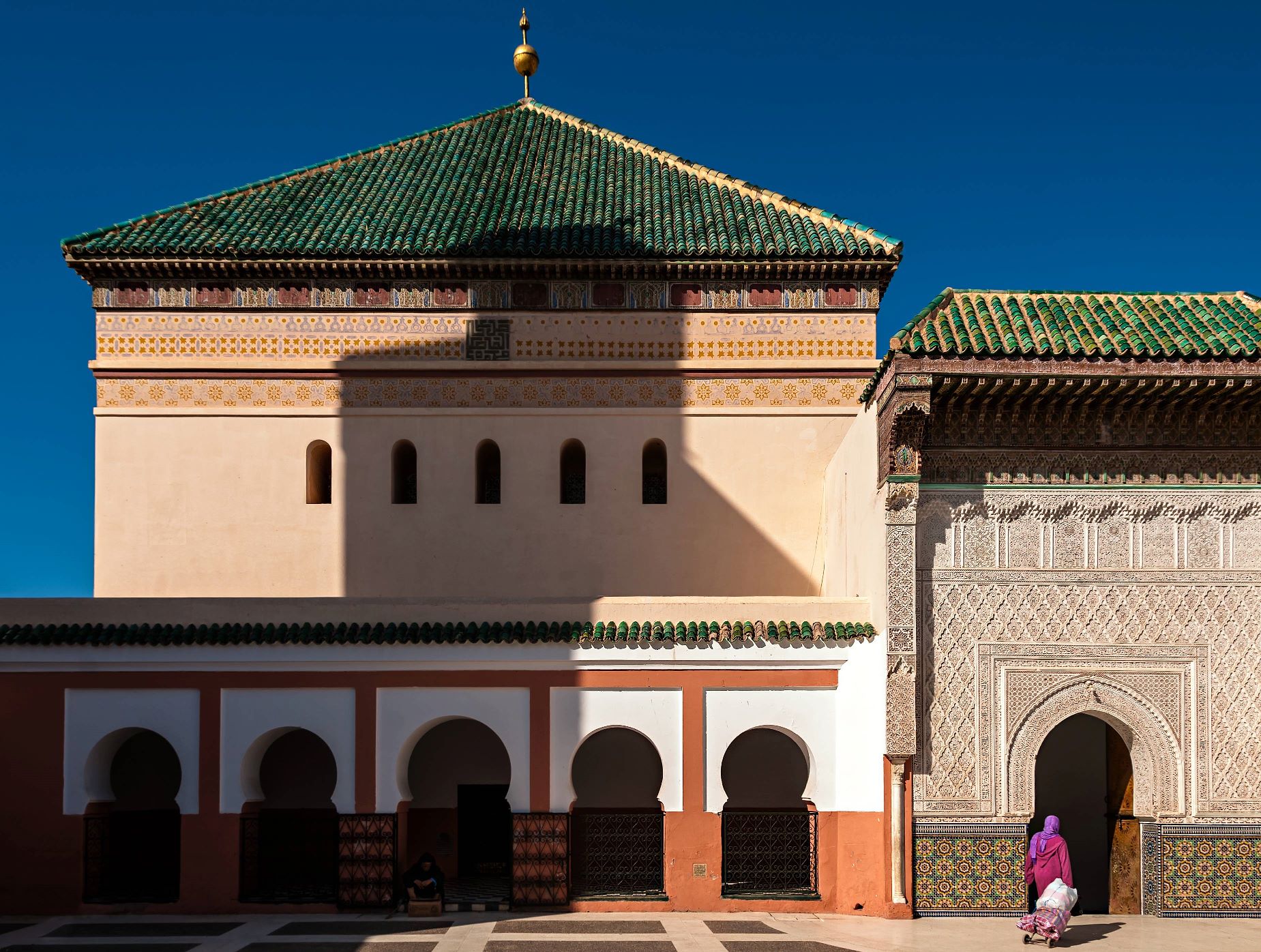
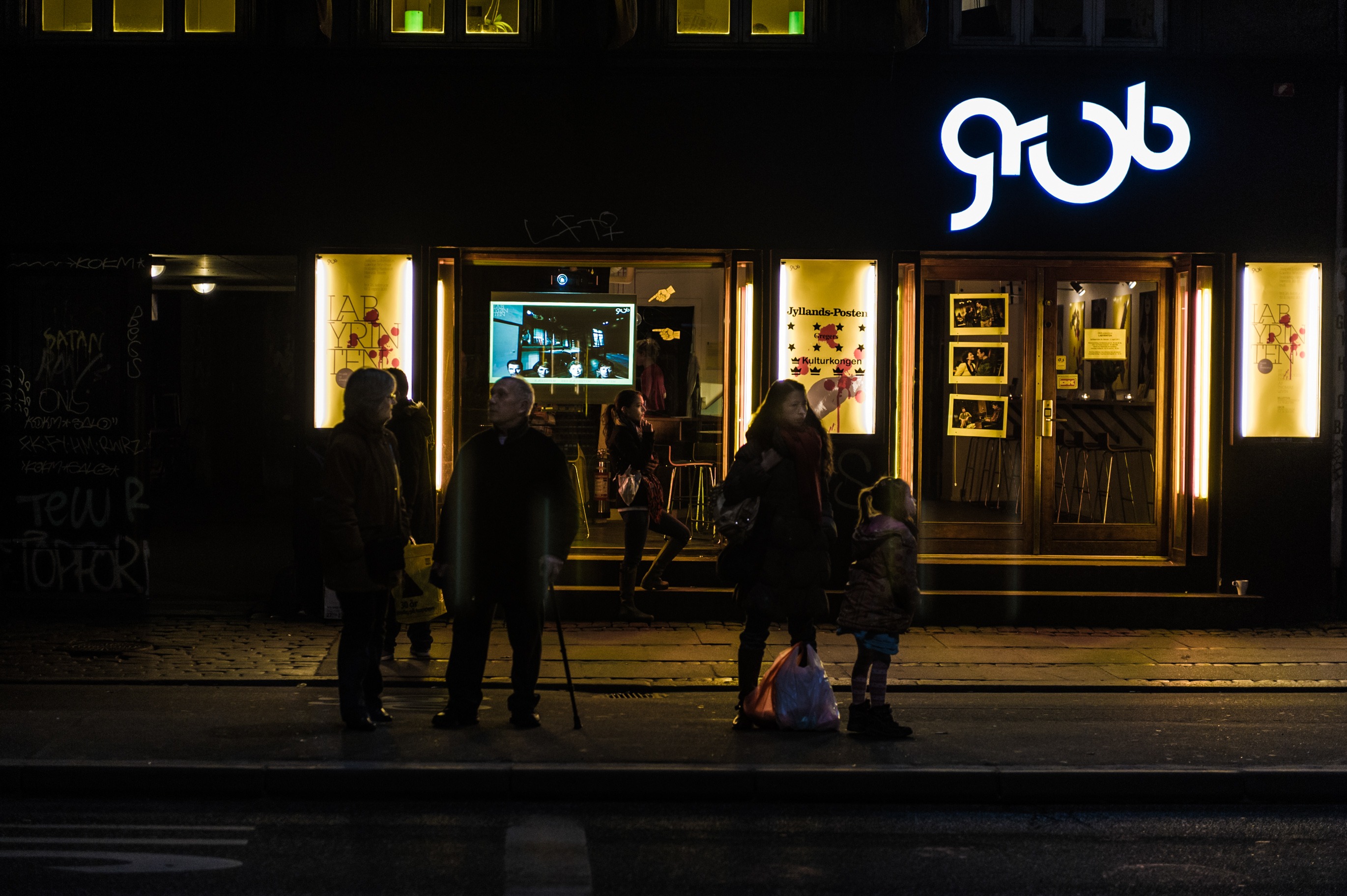
I really like this photo, but the Shadow is a bit to dominant. I don’t mind the lower part of it so much, but the top really ruins a lot of the feel of the photo, mostly because of the shape of the shadow
I was think about removing the top part – from a little above the green tiles and up – which is not impossible it would just take a lot of time, and I didn’t think it was worth it. And have just come to terms with it being there.
What do you think?
- Aperture: ƒ/8
- Camera: NIKON D300
- Focal length: 18mm
- ISO: 200
- Shutter speed: 1/400s
The lady and the tramp by Bo47 is licensed under a Creative Commons Attribution-NonCommercial-NoDerivatives 4.0 International License.

